Frank Lloyd Wright Organic Architecture Hand-Built Book
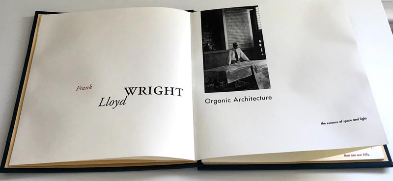
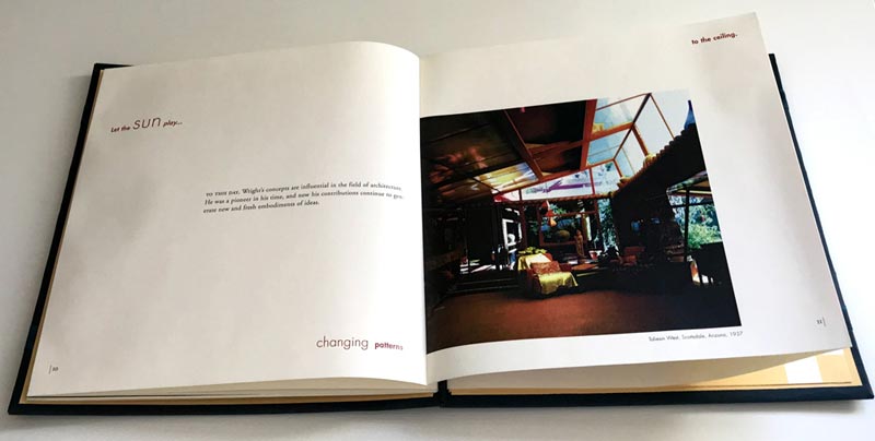
In 1996, while finishing course work at The Art Institute of Boston with an independent study under the tutelage of design department head, Geoffrey Fried, I was also the art director at Weller Advertising & Design in Portsmouth, NH. The drive back and forth from Portsmouth to Boston allowed time to think about my school project. The greatest challenge with the project was the lack of parameters — Geoff instructed me to pick a subject and do a project that was substantial enough to warrant the four credits allotted for the independent study. He purposely left the options open and said to let the project evolve as I see fit while I’m in the research phase. The subject I chose was Frank Lloyd Wright because I fell in love with his work during an architecture class I took at UNH years before. And since I was working in Portsmouth, it was convenient to go to the UNH library to do more research on him.
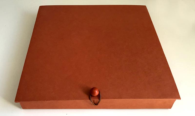
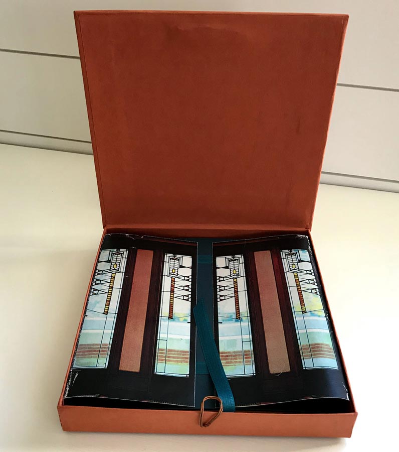
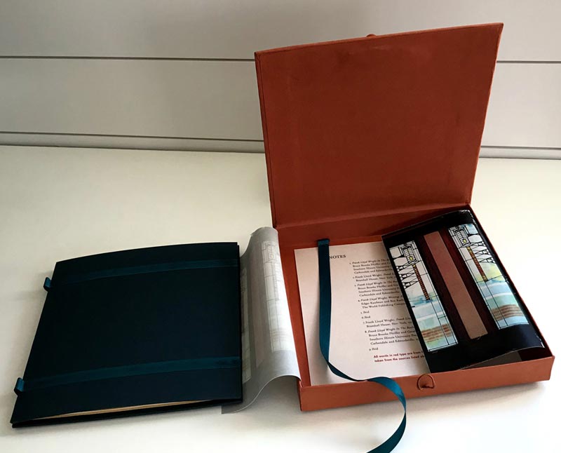
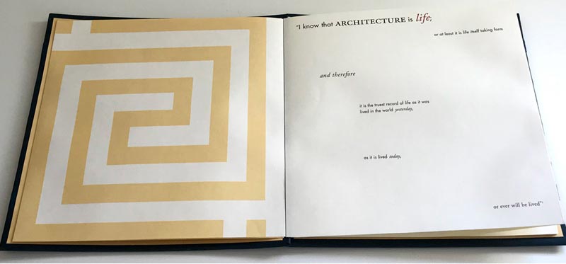
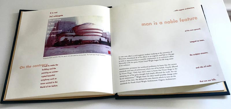
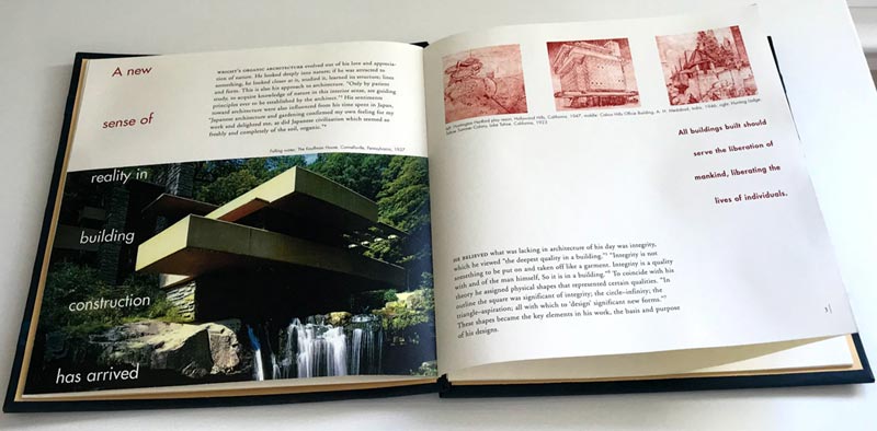
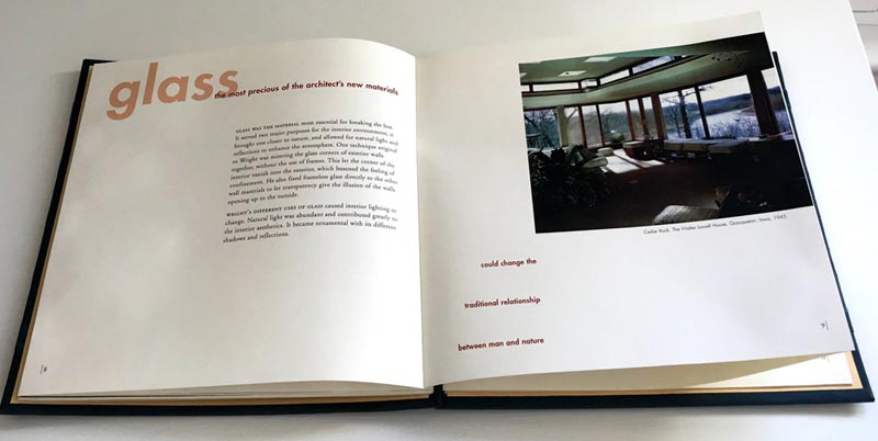
My project featured his organic architecture and keeping in line with his “truth to materials” I created a hand-built book with a French binding. A case was made to protect the book. It was perfect square with a perfectly round ball button closure. The lining paper in the case opened in the center to complement the photo of his French doors that are printed on it. The grid for the book was based on his favorite petroglyph that became his symbol for Taliesin West. The grid is printed on the inside front and back covers.
The project was a success and fulfilled my requirement for the independent study, which was the remaining coursework needed for my BFA. At graduation it was selected for the Purchase Award and the school kept the book for their achieves. The copy here is a duplicate I made soon after.
Frank Lloyd Wright – organic architecture book
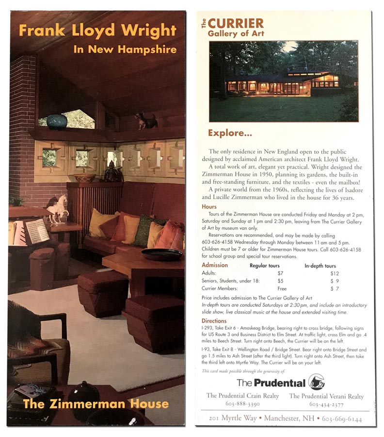
Frank Lloyd Wright Zimmerman House Rack Card
In 1997, I had the opportunity to work on another project featuring work by Frank Lloyd Wright. The Currier Gallery of Art (now the Currier Museum of Art) needed a rack card to promote their tours of the Wright’s Zimmerman House in the north end of Manchester, NH. It was a small project in scale but I approached it with the same enthusiasm as my Frank Lloyd Wright book project. The Currier allowed us to do a photoshoot in the house so I could obtain just the perfect photo for the card.
The Currier Gallery of Art – Zimmerman House rack card
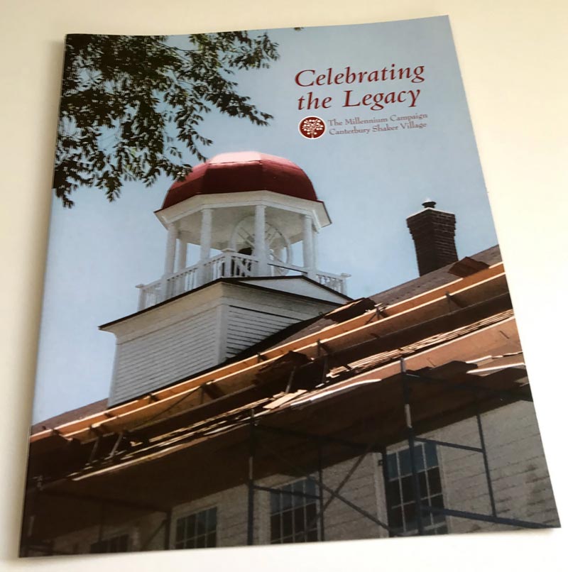
Canterbury Shaker Village Millennium Campaign Identity and Brochure
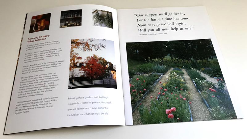
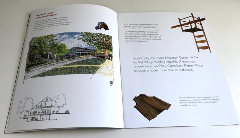
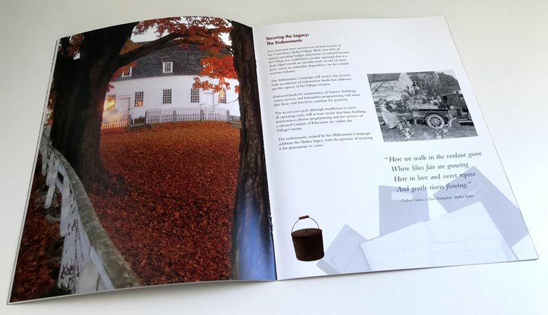
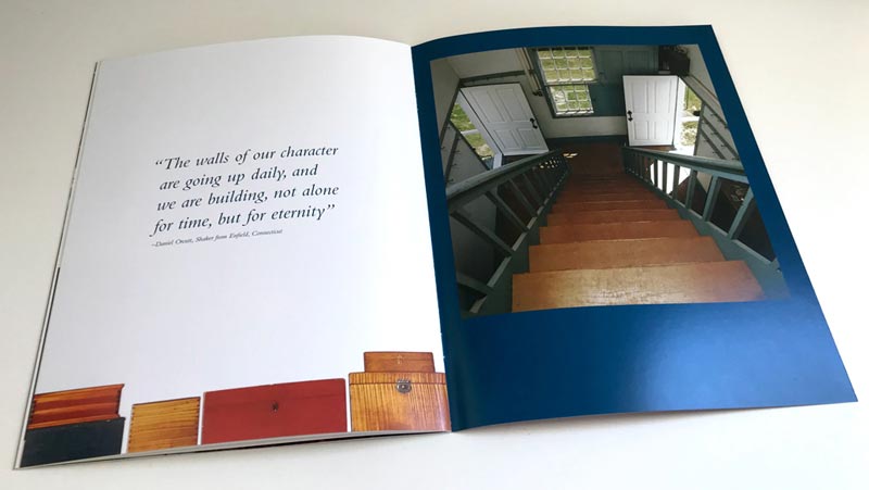
In 1999, the year I started Think Design, I was invited to create the Canterbury Shaker Village Millennium Campaign identity and brochure. It was very exciting to have a role in a campaign of such significance.
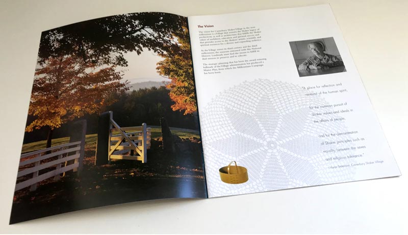
The campaign identity needed to complement the Canterbury Shaker Village logo and respect Shaker design principles. We determined the best design included the tree from their village logo set in a perfect circle with an outline. The brochure was designed to convey both past and present energy and spirit of the village.
Canterbury Shaker Village – millennium campaign identity

Canterbury Shaker Village – millennium campaign brochure
FCD Prevention Works
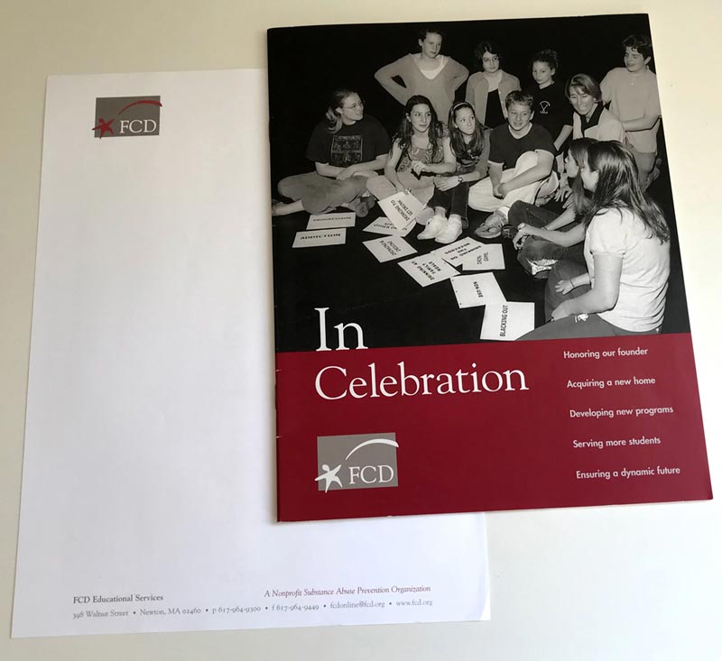
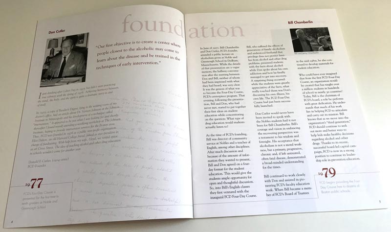
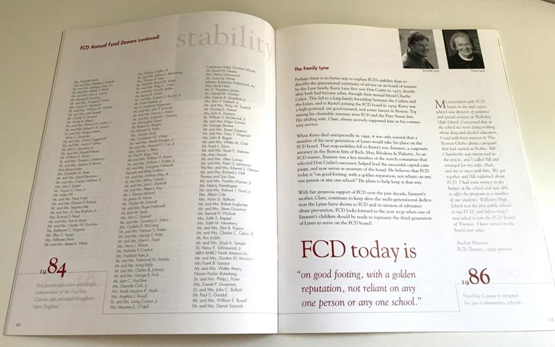
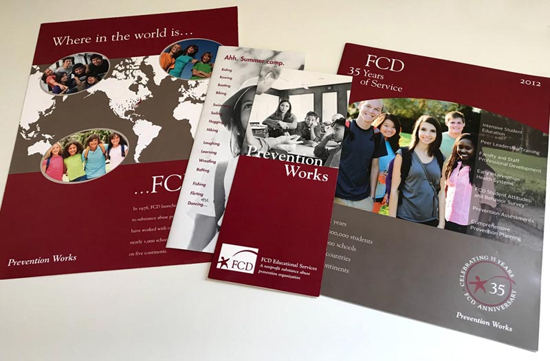
In 2002, FCD selected Think Design to assist them with a large body of work. We began with a name exploration. FCD (Freedom from Chemical Dependency) was considering changing their name but were hesitant because it was well known in their field. Think Design formed a team of creative professionals to work on renaming their organization. Prevention Works was the winner but they decided they weren’t ready to assign it as their new official name, so it became their tagline and is still used today. Their identity development was next, followed by their 25th Anniversary Retrospect Publication, which included a timeline, original letters written by founders and clients, anecdotes from staff members and their strategic plan for the future. Over the past 18 years, Think Design has partnered with FCD to produce their publications, appeals, exhibit displays and website. In 2015, FCD became affiliated with Hazelden Betty Ford Foundation. Think Design assisted in transitioning the FCD brand into the requirements of the Hazelden Betty Ford Foundation style guidelines.
FCD – identity and retrospect publication
